Ready Steady Store is working in partnership with Loft to make a digital mark on the self storage industry.
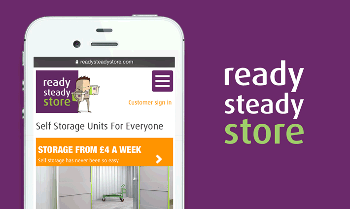
Recently, we’ve been focusing on improving Ready Steady Store’s mobile site experience to take advantage of a recent surge in mobile users.
We’ve built a refined quotation process and added some clever UX features to guide users through to completion and avoid all the annoyances that filling out forms on mobiles can bring.
Already a responsive site, we’ve given the homepage an overhaul for mobile devices to drive the Ready Steady Store brand message to audiences without compromising the usability of the site’s core features. We’ve also incorporated PictureFill 2.0, which enables us to serve optimised, mobile-friendly images without compromising the site for desktop users.
At Loft, we strive to deliver the best user experience in every site and application we create, regardless of the device: we don’t see why a smaller screen should mean a worse experience. Getting this right from the outset is key to people returning to use your site or services across all platforms and engaging over the long term.


